So much has changed in a year since I last updated the News From The Planet. Trump is now in power again in US and some of the scientific data sources that I have been using that monitor climate, weather and CO2 have been shut down or moved, luckily the datasets I use here are still functioning. I will continue to post the News From The Planet, seek out the data and turn them into stories, haikus and messages for the Future Machine as the future comes, despite the difficulties of the data being disappeared like quicksand, and trying to transform such enormous, complex meaning held by the data into the simplicity of a haiku.
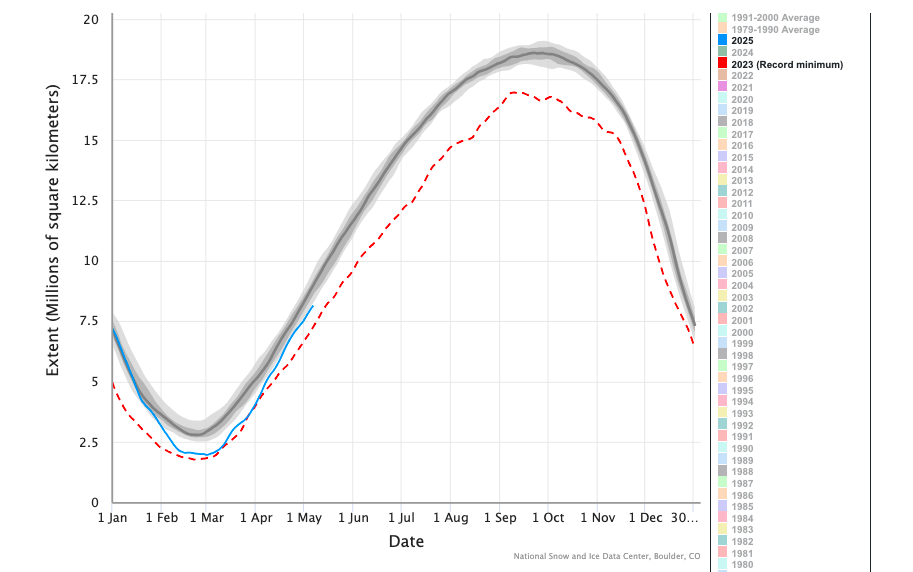
Antarctic Spring 2025
Lost. From the South Pole.
The largest drifting iceberg.
Melts in rising seas.
https://nsidc.org/sea-ice-today/sea-ice-tools/charctic-interactive-sea-ice-graph
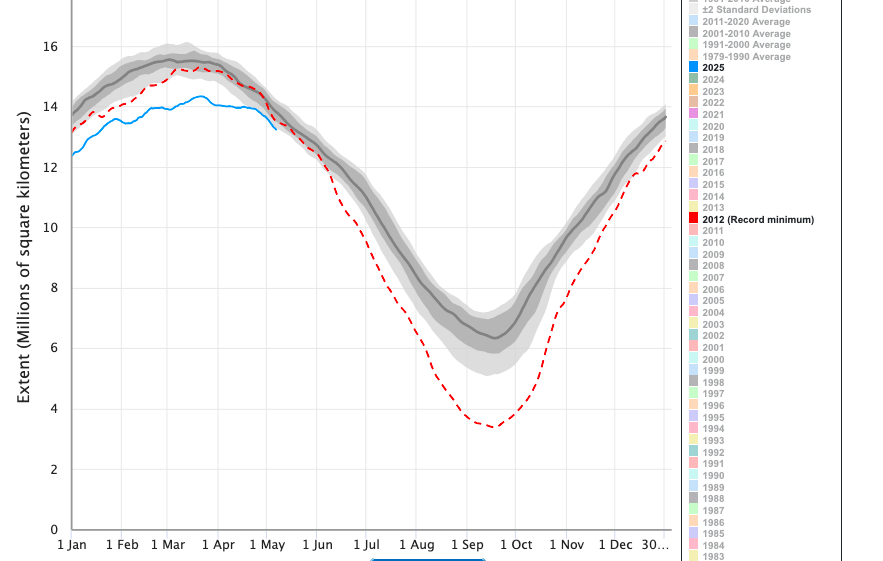
Arctic Spring 2025
Arctic’s warming Spring.
Ice melts to watery sea,
More than the most lost
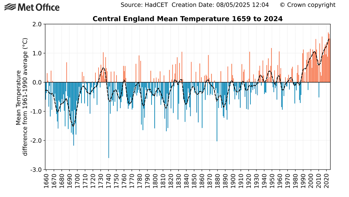
Nottingham Spring 2025
Flowers bloom from waste.
Christ Church Gardens rewilded.
Blossoms, flower pink.
https://www.metoffice.gov.uk/hadobs/hadcet/
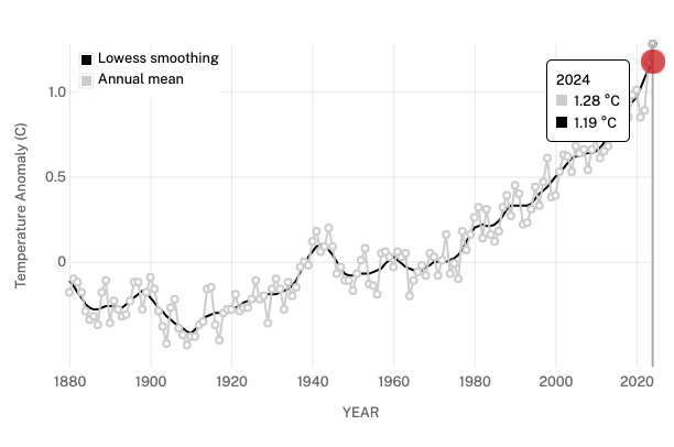
Planet Earth April 2025
Wildfires burning.
Our changing planet heats, floods.
Yet joy! Spring is here.
https://climate.nasa.gov/vital-signs/global-temperature/?intent=121